Colour influences mood before a single word is spoken. During a hectic workday, the appropriate palette can calm the mind, slow eye strain, and encourage teams to more focused attention and more pleasant dialogue. In 2025, offices are deploying colour more deliberately than ever before. Not as a splashy accent, but as a quiet system that supports how people work hour to hour.
Why colour matters at work
Colour influences attention, emotion, and even risk-taking. Frontiers in Psychology studies indicate that impacts depend on context, lightness, and type of task. In simple terms, a bright red wall close to screens can be pushy, but a glowing red stripe in a café can feel lively and inviting. The secret is to coordinate hue, saturation, and light with the work a space needs to perform.
If you are doing a complete refresh that synchronizes colour with layout, lighting, and furniture, transform your workspace with custom interiors can assist you in pinning down a palette and spec that works through floors.
Calm base, confident accents
The dominant pattern this year is simple. Keep the base quiet, let accents carry the identity. Use soft greiges, warm greys, muted sage, and pale blue-greens as the background. Incorporate one dominant accent such as terracotta, mustard, or deep teal in small quantities. This keeps screens legible and reduces visual noise while still giving the office a clear personality.
Zone colour by task, not by brand
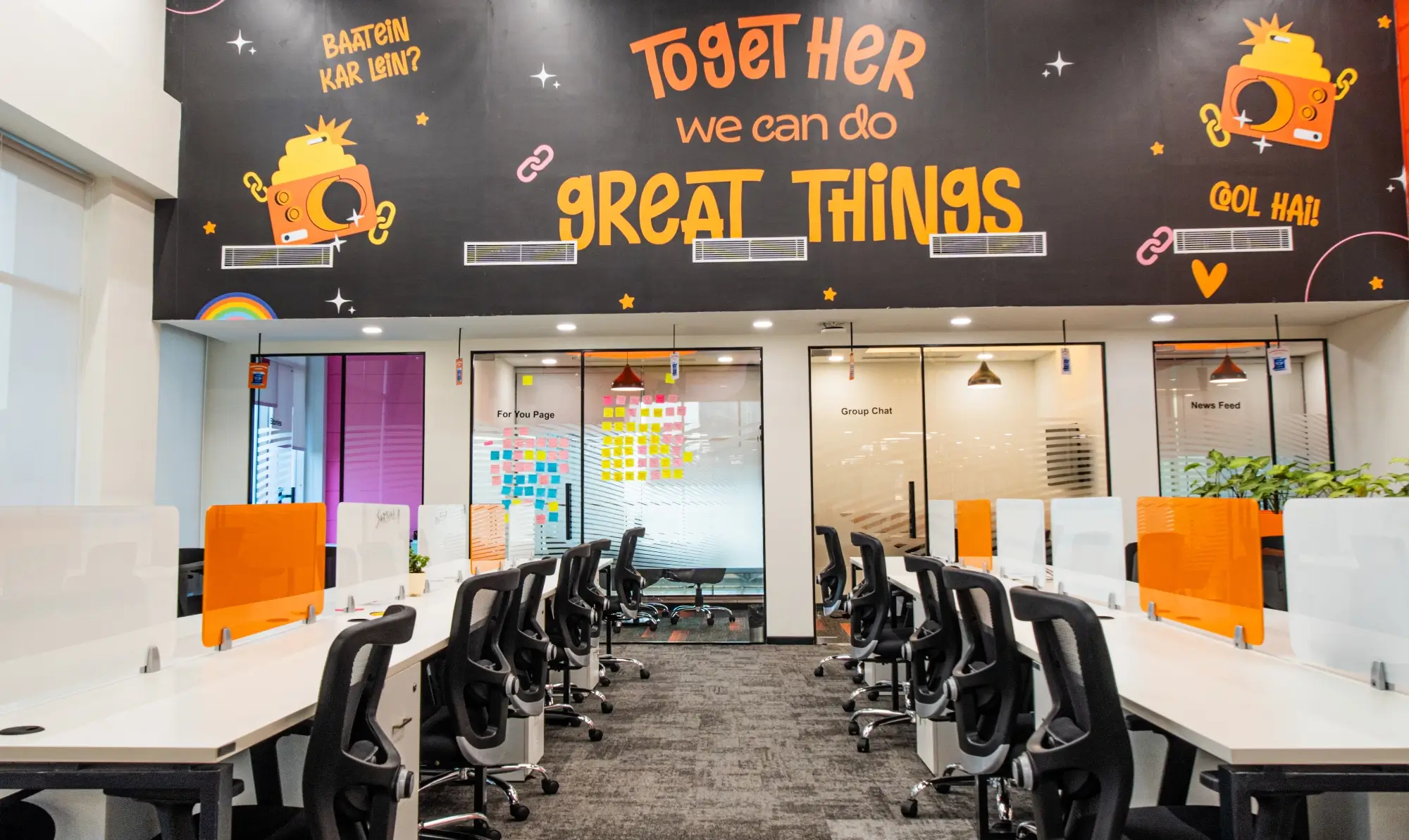
Colour now follows work modes. Focus spines get low-saturation, low-contrast backgrounds. Collaboration bays get warmer, slightly stronger tones to raise energy. Quiet rooms stay cool and steady. Brand shades still appear, but as trims, door frames, upholstery piping, and wayfinding, not as giant feature walls everywhere.
For quick, ready-to-adapt mood boards by zone, explore curated workspace designs for productivity and tune the palettes to your brand.
Light and colour planned together
Paint never looks the same under different light. Neutral, even task light keeps colour honest and eyes relaxed. The WELL Building Standard’s light concept is a helpful reference when you set targets. Aim for desk levels around 300 to 500 lux with neutral colour temperature near 4000 K. Use translucent blinds to soften harsh sun and seat people perpendicular to windows to cut glare.
Softer finishes over shiny surfaces
Matte finishes and textured materials reduce specular glare, which makes colours read more accurately and helps eyes settle. High-gloss paints and polished stone look dramatic but can reflect fixtures and screens, adding strain. In heads-down areas, matte and eggshell finishes feel calmer and photograph beautifully too.
Inclusive colour choices
Good palettes work for more than one kind of eye. Avoid relying on colour alone for wayfinding. Pair hue with shape or pattern. Keep strong reds and cyans out of large fields near screens because they can “vibrate” for some viewers. Use high-contrast signage for legibility and ensure text sits clearly against its background.
How specific colours tend to feel at work
- Blues and blue-greens feel steady and clear. They are popular in focus zones, strategy rooms, and anywhere long reading or code work happens.
- Greens suggest restoration and balance. Sage and olive calm open bays without looking dull.
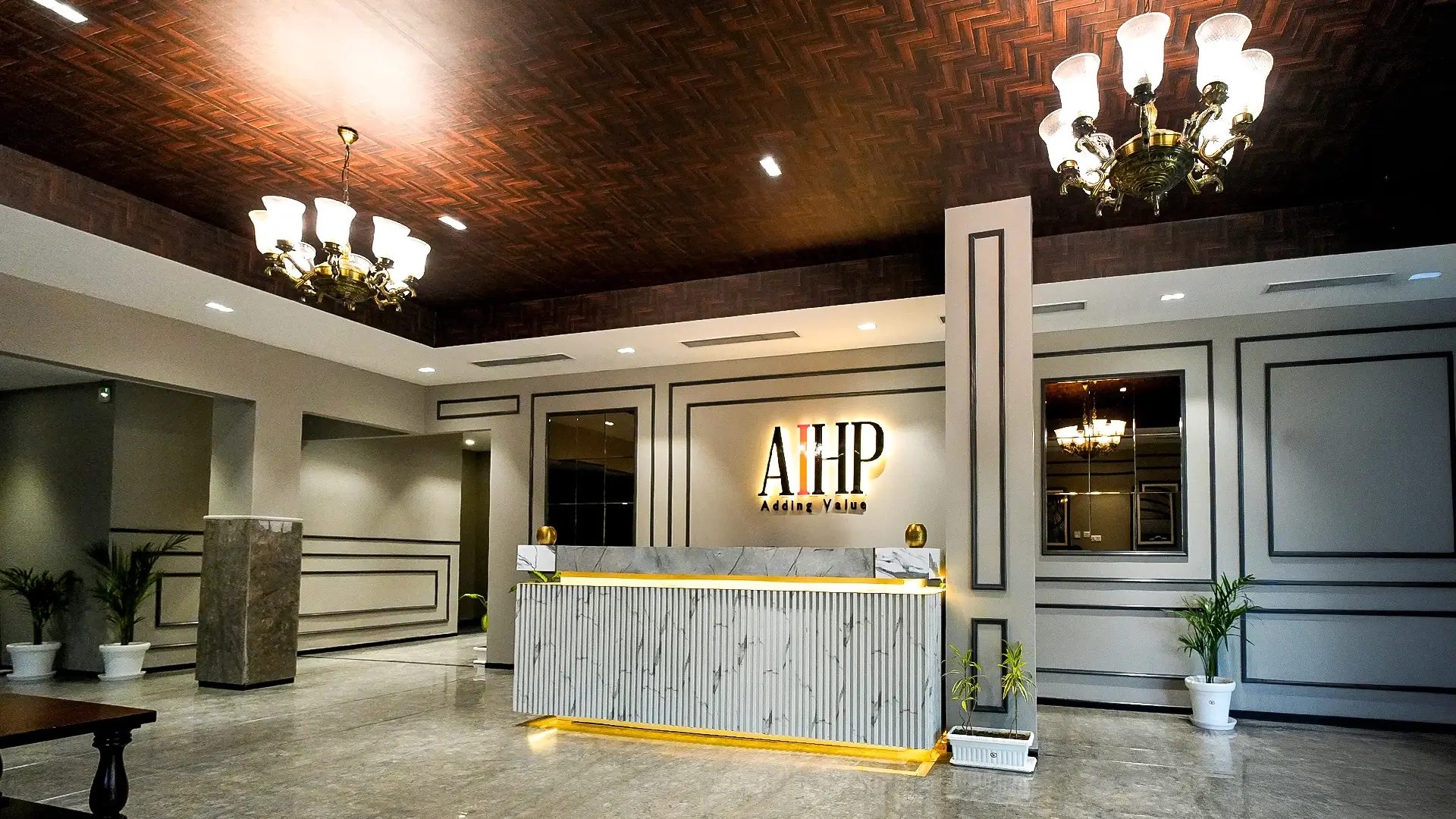
- Warm neutrals like greige and sand create a welcoming background that is easily paired with natural textures.
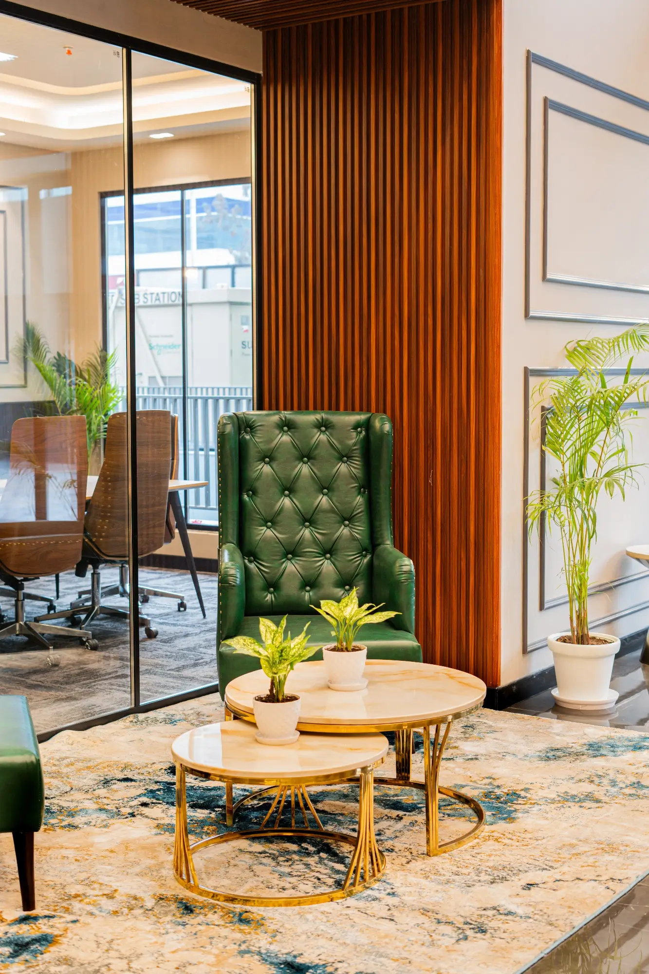
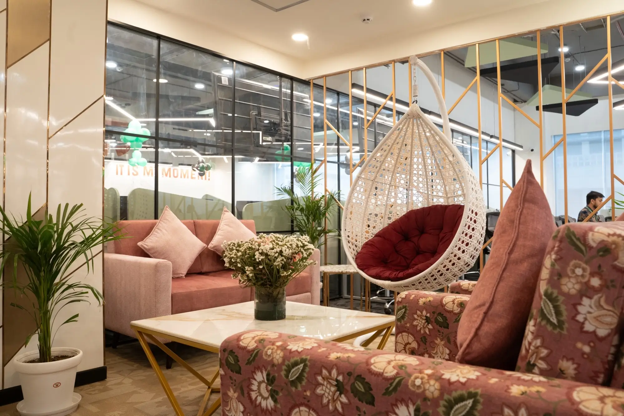
- Terracotta, mustard, and coral bring social vitality and heat to cafés and collaboration spaces.
- Reds increase salience. Useful in signals and small accents, but too much can feel tense in heads-down zones.
- Charcoal and deep navy are strong for trims and frames. In full walls, keep them limited or well lit to avoid heaviness.
Saturation and contrast: the quiet ergonomics of colour
Saturation attracts the eye. That is great for signage and edges. It is tiring when it fills the whole view. Keep the background low to mid saturation, then place accents to lead the eye where decisions are made. Maintain comfortable contrast near screens and whiteboards so content can pop without a halo of glare.
For digital eye strain, the American Optometric Association suggests the 20-20-20 rule of breaks. Colour can’t replace breaks, but calming backgrounds make intervening hours gentler on the eyes.
Colour by room type: a quick map
Focus spines
Soft neutrals, pale blues, sage. Matte walls, matte surfaces, less visual clutter. Tuck accents out of the direct view line. If you do have a stripe, place it behind the user, not in front of the screen.
Huddle rooms (2–4 people)
Mid-tone neutrals with one warm accent on a single plane. It should energise without stealing attention from the screen. Add a fabric panel to clean up acoustics so speech feels natural.
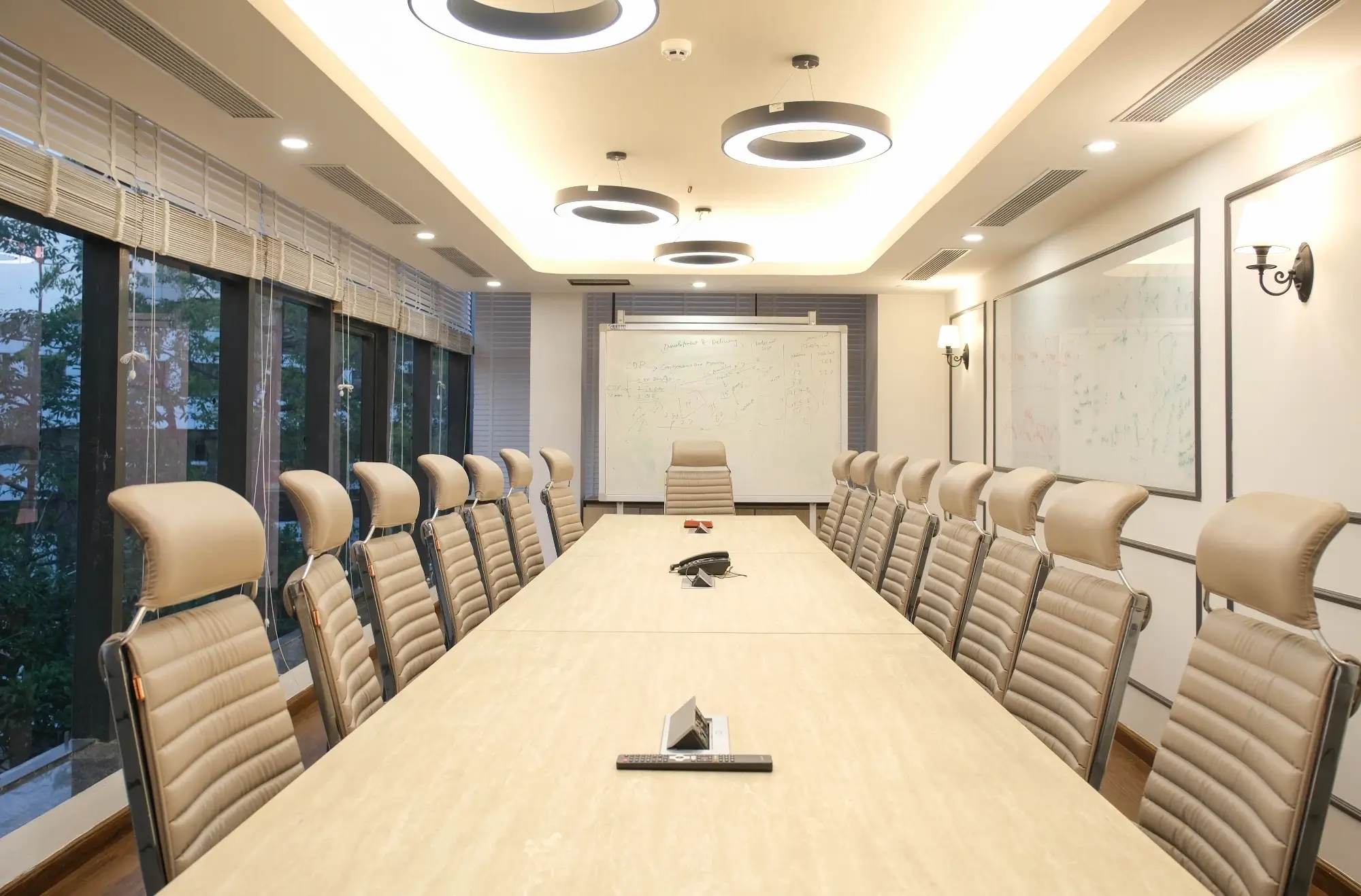
Board and strategy rooms
Cooler neutrals with restrained accents. The goal is long, clear thinking. Strong colour belongs in art or a single panel, not across every wall.
Cafés and lounges
Warmer palette with terracotta, tan, or amber. Mix with timber and greenery for a relaxed, social feel. At night, dimmable warm light keeps faces pleasant and glare low.
Circulation and wayfinding
Use accent colour to guide turns and signal landmarks. Repeat the same tone at every decision point so people learn the path without reading signs twice.
Cultural and local cues that matter in India
Many Indian teams prefer warm, welcoming bases that do not look clinical. Off-whites that are slightly tinted cream look better than pure white under intense sunlight. Earth colors and natural textures complement houseplants and lend a feeling of welcome. If your brand employs bold primaries, introduce them in the form of trims, signage, and artwork rather than wall washes in focal points.
How to test a palette without regret
- Paint two or three sample boards and move them around during the day. Check morning, afternoon, and late evening.
- View colours under the actual fixtures and blinds you will use.
- Place a laptop and a printout nearby to judge real contrast.
- Ask three quick questions: Does it reduce glare, keep text legible, and feel calm at a glance?
Mistakes to avoid
- All-white walls that look clear but create glare and eye fatigue.
- Over-branding with strong colours across big surfaces. Keep brand in trims, joinery details, and wayfinding.
- Choosing colours without checking the lighting plan. Fix lights and blinds first, then finalise paint.
- High-gloss surfaces near screens that bounce reflections into eyes.
- Using colour alone to convey direction or rules.
A simple 30-day colour plan
- Week 1: Audit glare and the noisiest sightlines. Rotate a few desks perpendicular to windows and set blinds.
- Week 2: Mock up one huddle and one focus zone with sample boards. Collect quick feedback on mood, clarity, and glare.
- Week 3: Lock the base and one accent per zone. Specify matte or eggshell finishes in focus areas.
- Week 4: Roll out in phases. Start with the worst hot spots first. Tie colour updates to small acoustic and lighting fixes for the best impact.
When you want a palette turned into a build-ready spec with finishes, codes, and samples, Contact our experts for workspace planning and we will map it zone by zone.
Conclusion
Colour is not decoration. It is a daily tool for clarity, calm, and connection. In 2025, the strongest offices use a quiet base, task-led accents, and lighting that respects the eyes. Test small, learn fast, and repeat across the floor. People will feel the difference even if they cannot name it. That is good design at work.