You can walk into a brand-new office, see fresh paint, new furniture, and polished floors… and still hear people say:
“It’s so noisy here.”
“I can never find a place to think.”
“Why is this corner always so dark?”
That gap between how an office looks and how it feels to work in usually comes from the same place: rushed planning.
In 2026, when teams already have options and hybrid is normal, a badly planned office doesn’t just annoy people. It quietly hits productivity, retention, and even how clients see your brand.
If you’re redoing your workspace with a partner like Orange Offices, it’s worth slowing down and checking you’re not walking straight into these seven office design mistakes.
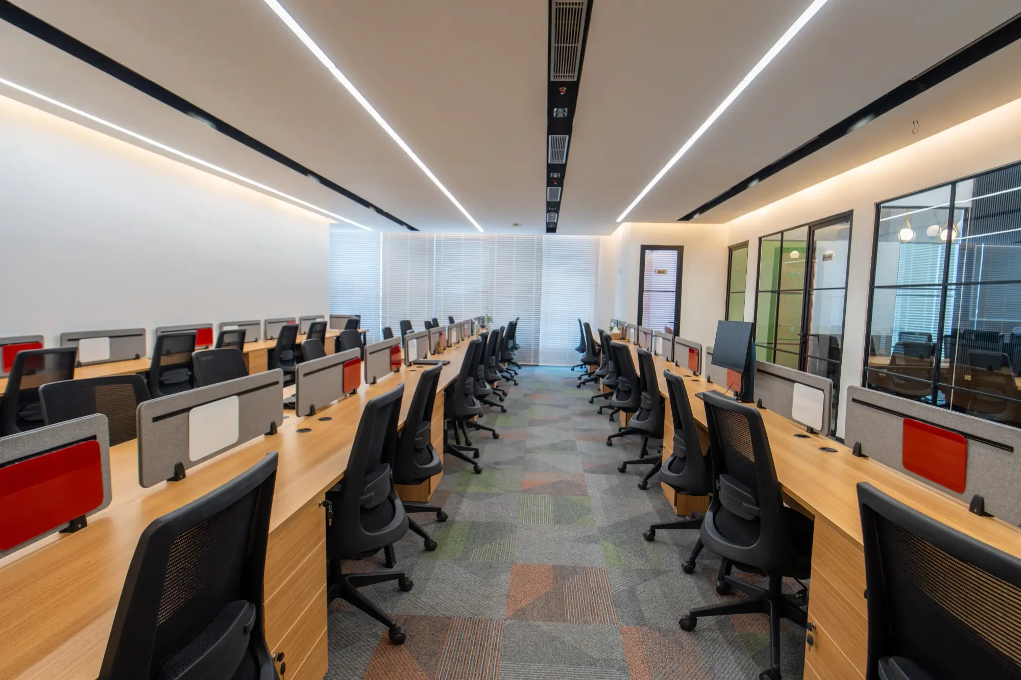
1. Starting with seats instead of work
Most projects still open with a simple question:
“We have X employees. How many seats can we fit?” Logical, but incomplete.
In one office you might have:
- A finance team that needs long focus blocks
- Sales and support who live on calls
- Product or tech folks who huddle around whiteboards
- Leadership bouncing between reviews, one-to-ones, and quiet thinking time
Treat them all like identical “chairs” and the layout will always feel slightly wrong. People will hoard meeting rooms just for quiet, take calls in staircases, or stay home on days they need to concentrate.
You don’t have a seat problem. You have a work-modes problem.
Do this instead
Before you touch a layout, run a simple work-mode exercise:
- When do teams need silence?
- Who is noisy by nature?
- Which groups collaborate with each other daily, not just on paper?
- Do some teams need project rooms they can “own” for a few weeks?
Once you’ve mapped that, your office interior design services partner can design focus zones, buzzier collaboration pockets, and flexible project spaces instead of one giant slab of workstations.
2. Hoping acoustics will sort themselves out
Noise is the complaint that shows up a few weeks after move-in:
- Everyone’s on video calls
- Glass and hard flooring bounce sound around
- One loud conversation travels across the floor
Suddenly, half the office is wearing headphones just to survive a workday.
We obsess over colour palettes and finishes, then leave sound to chance.
Do this instead
Treat acoustics as infrastructure, not decoration:
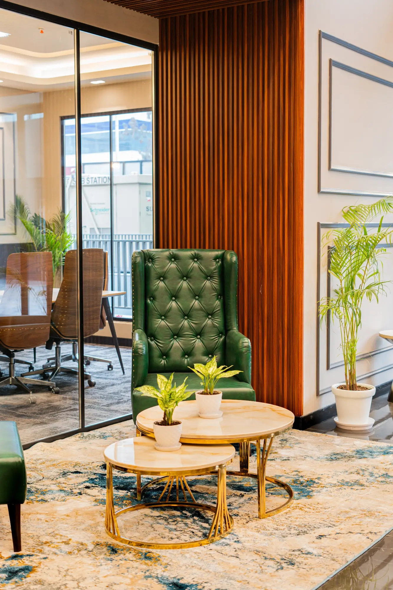
- Balance hard materials (glass, stone, metal) with soft ones (acoustic panels, fabric, rugs, upholstered seating) so sound has somewhere to go.
- Keep high-chatter teams away from deep-focus roles.
- Add actual phone booths and 1–2 person focus rooms, so every small call doesn’t hijack a 10-seater meeting room.
People-centric frameworks like the WELL Building Standard literally list sound and comfort as core concepts for a healthy workplace. You don’t need the plaque on the wall, but you can definitely borrow the logic.
3. Forgetting storage and circulation
Day 1 photos always look amazing.
By Month 3, reality creeps in:
- Extra chairs parked in every corner
- Boxes sitting in corridors “just for now”
- Pantry stock on every flat surface
- Chargers, cables, and random gear all over the place
Most of the time, that isn’t “messy employees.” It’s a layout that never gave their stuff a proper home.
Then there’s circulation. If every aisle is a tight squeeze, people are side-stepping each other all day, trolleys struggle to move, and any kind of delivery or maintenance feels like a mini-event.
Do this instead
When you review the plan, force yourself to answer unglamorous questions:
- Where do bags, helmets, and personal items live if not on chairs?
- Where does IT keep spares and returns?
- Where does bulk pantry stock sit?
- Where do courier packages land while they’re waiting to be opened?
Give those functions real square footage.
Then walk the floor on paper: can someone do a full loop around the main workstation areas without bumping into chairs or columns?
If you want a structured lens to sanity-check space planning, share Orange Offices’ own article – 10 Elements of a Well Designed Office Building with everyone in the decision chain and benchmark your drawing against it.
4. Treating lighting as “enough lux”
Plenty of offices are technically “within norms” for illumination and still feel bad to sit in.
You’ve probably seen spaces where:
- Everything is one flat, cold white
- Screens are fighting glare from overhead fittings
- Corners feel gloomy even at midday
- Meeting rooms look fine to the eye but strange on camera
Light affects mood, accuracy, and even sleep. WELL-aligned research keeps coming back to the same point: it’s not just about how bright it is, it’s about quality, contrast, and glare.
Do this instead
Think in layers:
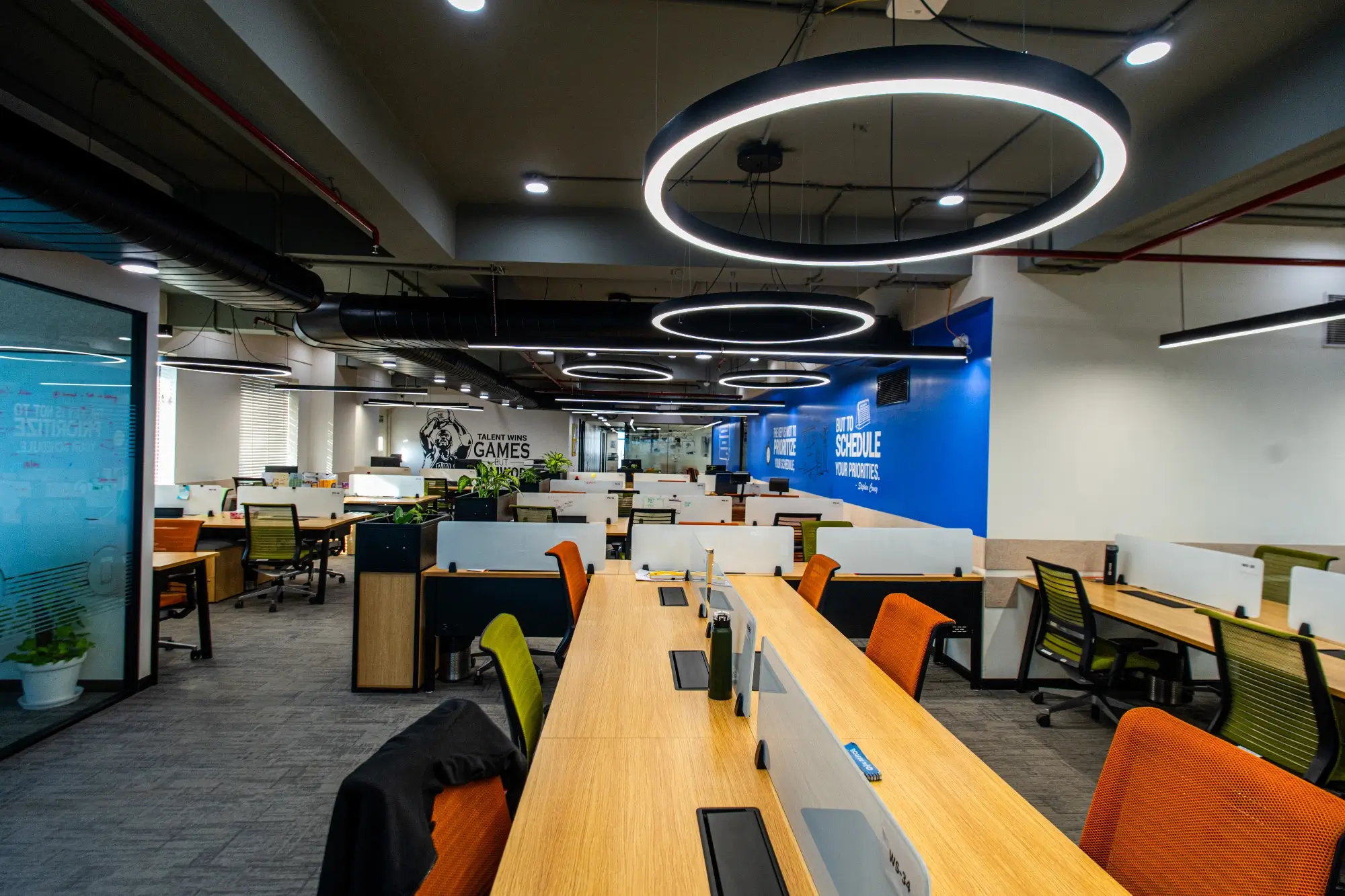
- A base layer of even ambient light so nobody’s squinting
- Task lighting where people read, write, or work on screens for hours
- Mood lighting in cafes, lounges, and visitor zones so the office doesn’t feel like one long corridor
Plan lighting alongside materials. That way you avoid super glossy worktops, awkward shadows, and reflections in glass where you actually need clarity.
The goal: people shouldn’t notice the lighting at all. They should just feel comfortable.
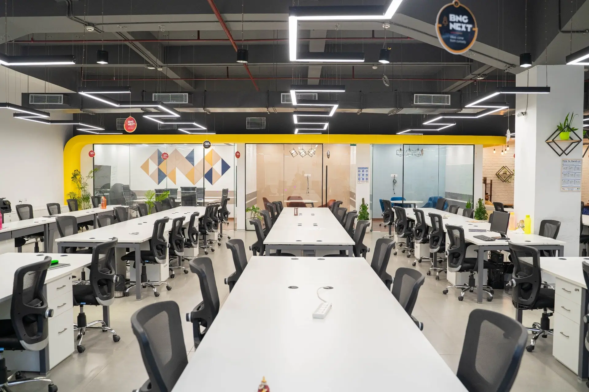
5. Squeezing in “just a few more” seats
Every project hits this moment:
“If we tighten things slightly, can we add ten more workstations?”
Do that once and you might get away with it. Do it three times and suddenly:
- Chairs are nearly back-to-back
- Aisles feel like aircraft aisles
- There’s nowhere to perch for a five-minute chat
- The whole floor feels like exam seating
Bodies like BIFMA exist purely to define safety, durability, and performance standards for commercial furniture so that people can sit and move without hurting themselves over time. You won’t quote those standards in a town-hall, but you’ll definitely feel it if you ignore them.
Do this instead
- Decide the minimum comfort line for clearances, aisle widths, and personal space… and stick to it.
- Mix fixed desks with hot desks and shared project tables instead of treating every square inch as a permanent workstation.
- Keep a little slack in each bay so you can absorb a hiring spike without wrecking the plan.
Short term, squeezing feels “efficient.” Long term, it’s one of the fastest ways to make the office a place people tolerate, not enjoy.
6. Designing a frozen office for a moving company
Your org chart is going to change. Roles will appear and disappear. Teams will grow unevenly. Tools will change.
If your layout can’t handle that, you’ll be stuck in a cycle of:
- Small, messy alterations every few months
- Extra partitions that never quite make sense
- “Temporary” desks that live forever in the wrong spots
Indian green-building frameworks like the IGBC Green Interiors rating explicitly talk about flexibility and efficient, tenant-occupied fit-outs, because change is the rule, not the exception.
Do this instead
Design for 1–2 future scenarios, not just today:
- Mark zones that can flip between collaboration and extra seating as needs change
- Use modular partitions or demountable glass where you can, so “replanning” doesn’t always mean “demolition”
- Leave a bit of headroom in power, data, and HVAC so you’re not opening ceilings every time a new team arrives
You don’t need to predict everything. You just need to avoid painting yourself into a corner.
7. Treating branding like wallpaper
Brand usually comes up near the end:
“We’ll do a logo in reception and maybe one Instagram wall?”
That’s not branding. That’s labelling.
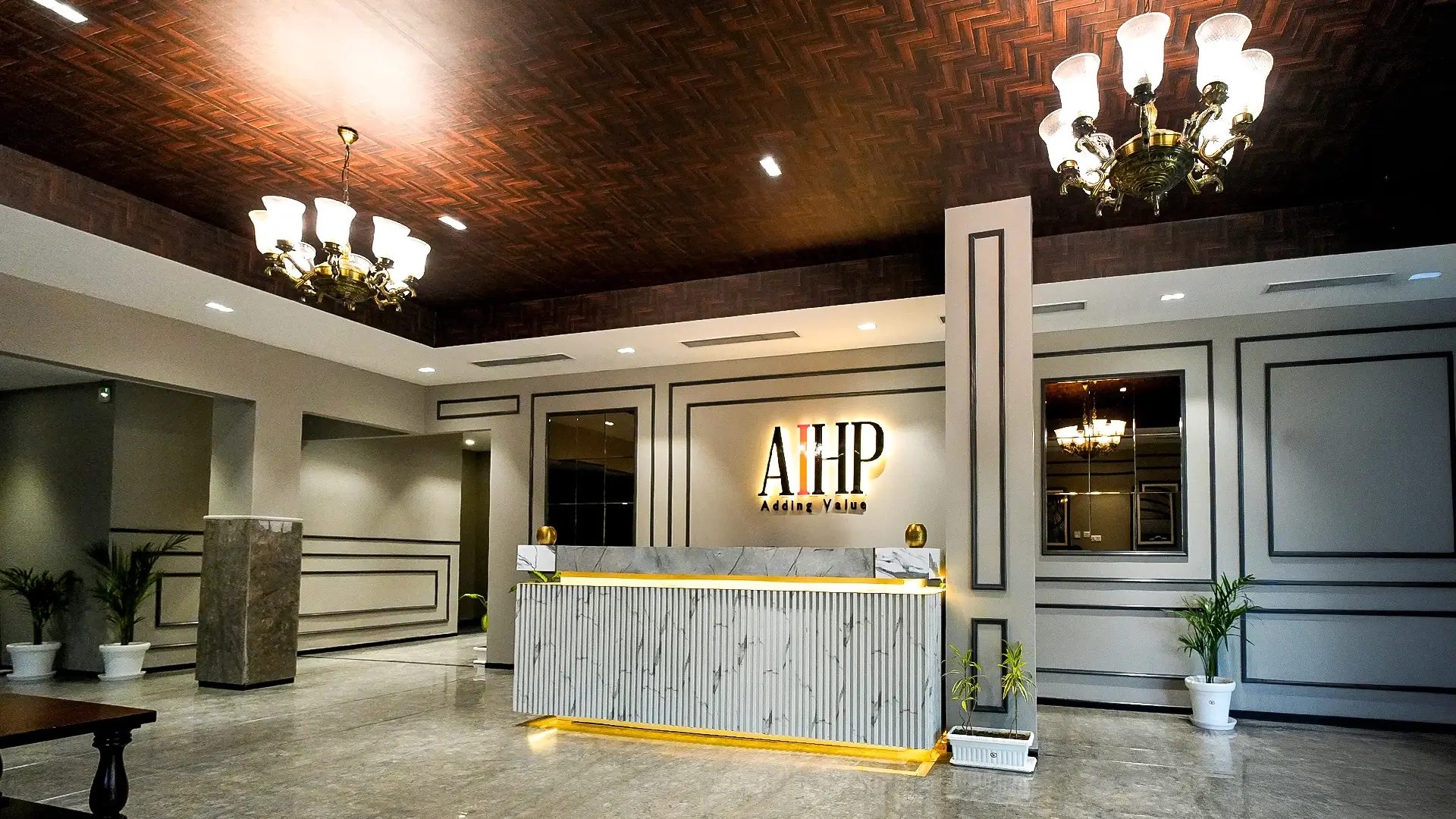
A space that genuinely feels like your company doesn’t need a logo every ten feet. It shows up in:
- The overall mood (warm, minimal, bold, playful)
- The materials and textures you choose
- How reception, client areas, and cafes are staged
- The kind of art, graphics, and messaging you live with every day
Do this instead
Start with a simple question:
If we removed every logo from this office, would it still feel like us?
If the answer is “no,” move brand decisions earlier in the process:
- Build a palette that’s honest to your culture, not just your brand colours
- Pick a couple of “hero” areas where the brand gets a fuller expression
- Let the rest of the office stay calmer and more timeless
If decision-makers struggle to picture this, walk them through real projects in the Orange Offices interior gallery. Orange Offices Seeing how palette, layout, and brand come together in built spaces usually lands better than any moodboard.
Wrapping it up
Most bad offices don’t come from bad taste.
They come from rushing the boring parts:
- Skipping the work-modes conversation
- Hoping acoustics and lighting will somehow work out
- Sacrificing storage and circulation to chase seat counts
- Ignoring how fast the company might evolve
- Dropping “branding” in at the end like a sticker
The good news: all seven mistakes are avoidable if you slow the early phase down and get HR, business heads, finance, and your design partner looking at the same picture.