Colour isn’t just styling, it’s a quiet nudge that shapes how people feel, think and act at work. Get it right and your workplace becomes calmer, clearer and more energising without moving a single partition. Get it wrong and you invite glare, eye strain and mental clutter. This guide shows how colour behaves in real offices, where it helps most, and how to build a palette that fits your brand and your people.
How Color Works on Us (and Why Context Matters)
Colour influences attention, emotion, and behavior but not in a universal formula. Associations change with brightness, saturation, lighting, and even culture. Solid research suggests color can prime avoidance or approach behaviours (for example, red signalling caution in achievement settings), and that effects depend heavily on context and task. A broad review in Frontiers in Psychology is clear on this nuance: use color as a cue, not a cure-all. (Source: PubMed Central)
The Big Three: Hue, Saturation, and Brightness
- Hue is the “family” (blue, green, red).
- Saturation is intensity (muted vs. vivid).
- Brightness (value) is the degree to which the color is light or dark.
Tiny adjustments here completely alter the feel of a room often more so than simply switching the hue itself. A muted green can be restful; a highly saturated green on a vast wall can feel loud. Pair strong accents with plenty of neutral “breathing room.”
Light + Color = The Real Experience
Paint never appears exactly the same under varying light. Cool, bright light serves to cut sharp edges and alertness; warmer light softens and calms. Studies in office-like settings show that combinations of illuminance and correlated color temperature (CCT) influence mental workload, mood, and comfort so test your palette under the lights you’ll actually use, not just in daylight. (Source: Nature, PubMed Central)
Color by Zone: A Practical Map
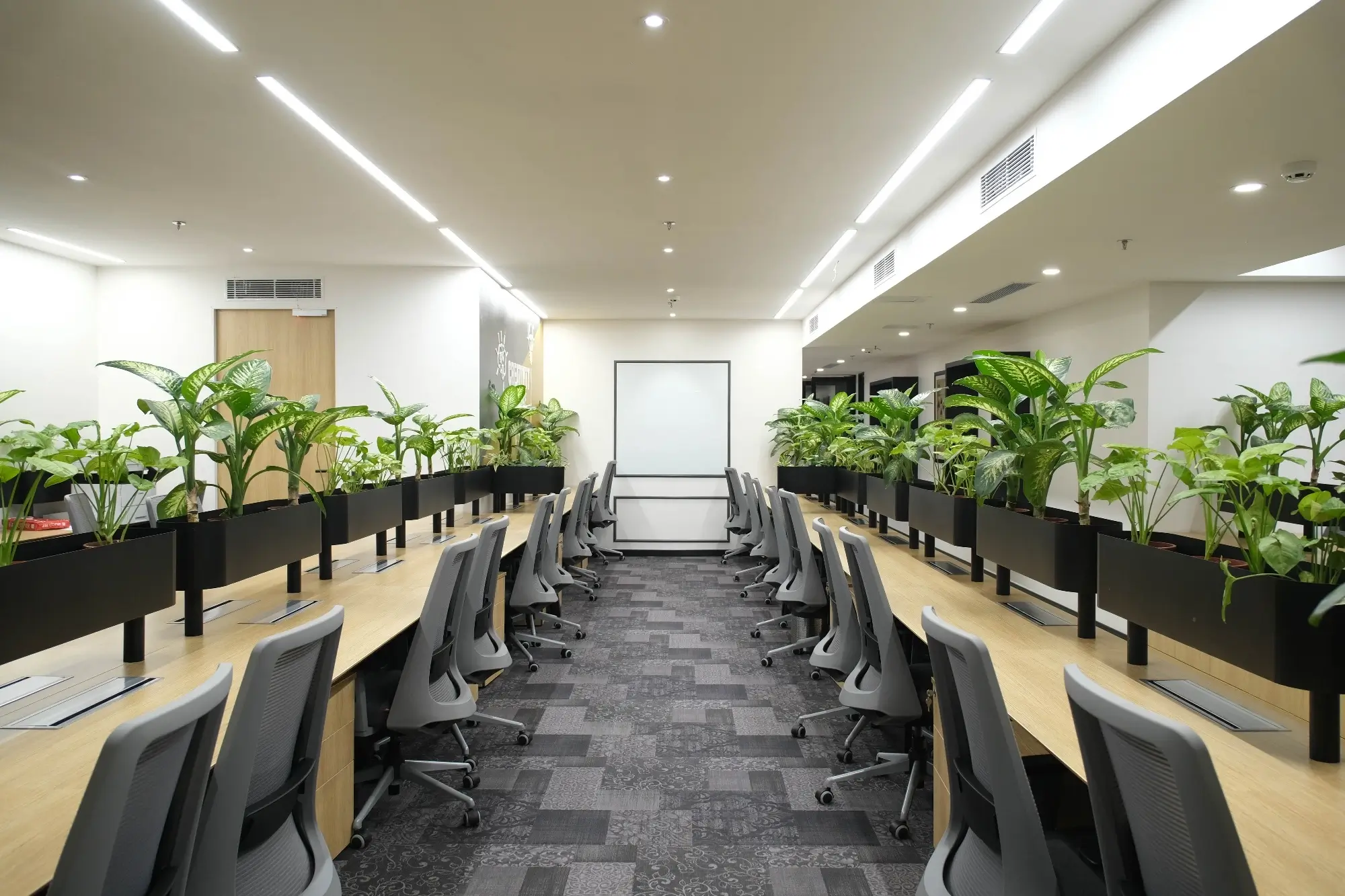
Focus Zones (individual work)
Lean on calm, lower-saturation hues: gentle blues, blue-greens, sage, warm greige. These tones reduce visual noise and help the eyes rest on text and screens. Keep contrast moderate so edges are legible without harshness.
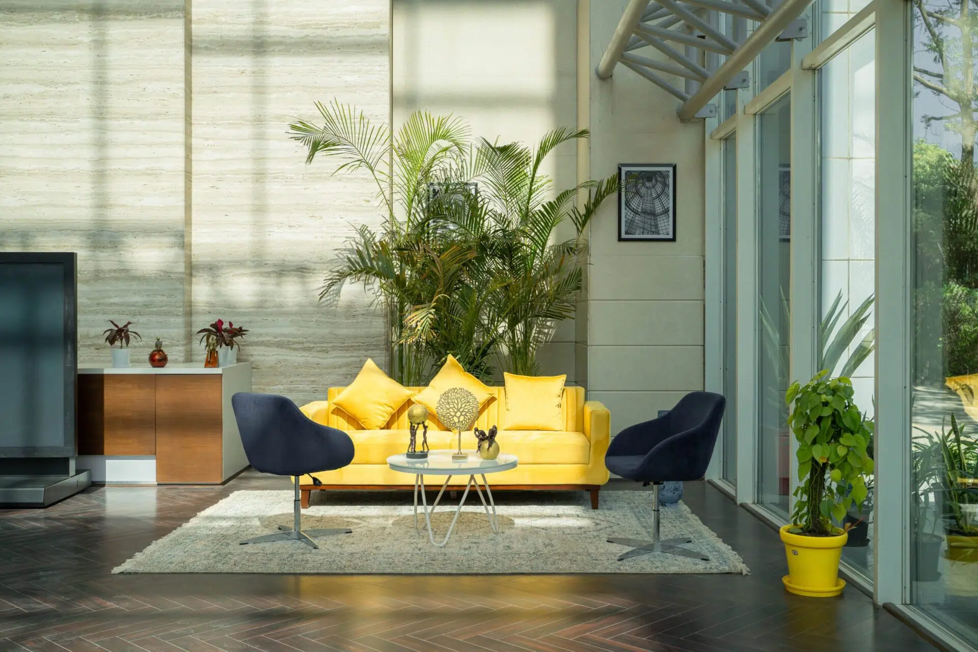
Collaboration Areas (project bays, stand-ups)
You want energy without chaos. Employ a neutral foundation and introduce one energetic accent mustard, terracotta, or assertive teal on one wall, column, or ceiling stripe. Too many accents in one view = attention scatter.
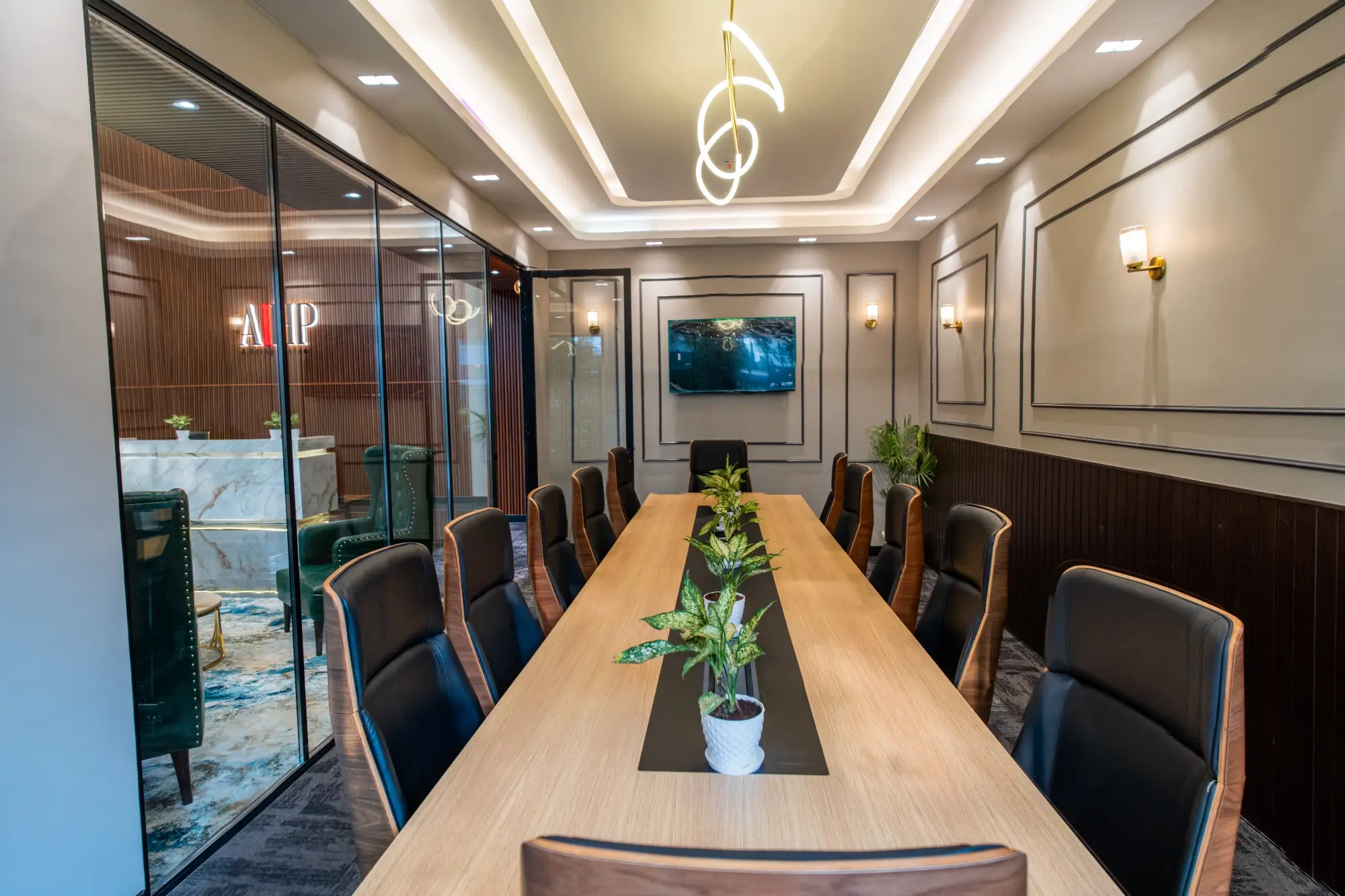
Meeting Rooms
Match color to meeting type.
- Quick huddles: mid-tone neutrals + a warm accent for momentum.
- Deep dives/strategy: cooler neutrals with restrained accents to keep cognitive load low.
- Client rooms: pull through brand colors, but in measured doses to avoid “showroom glare.”
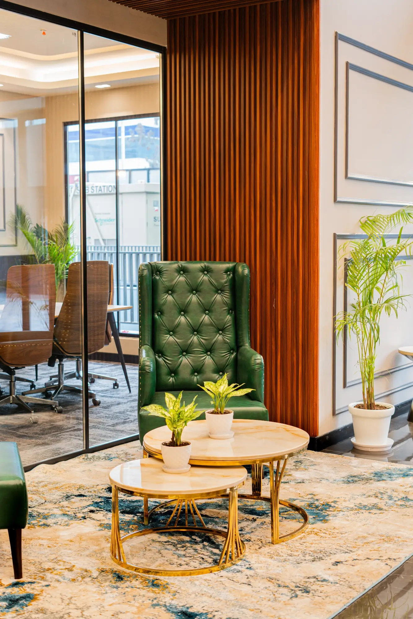
Regeneration Spaces (cafes, lounges, well-being)
Warm, muted palettes with earthy textures (wood, rattan, greenery) communicate permission to unwind. Reserve saturation; allow lighting and material to carry the load.
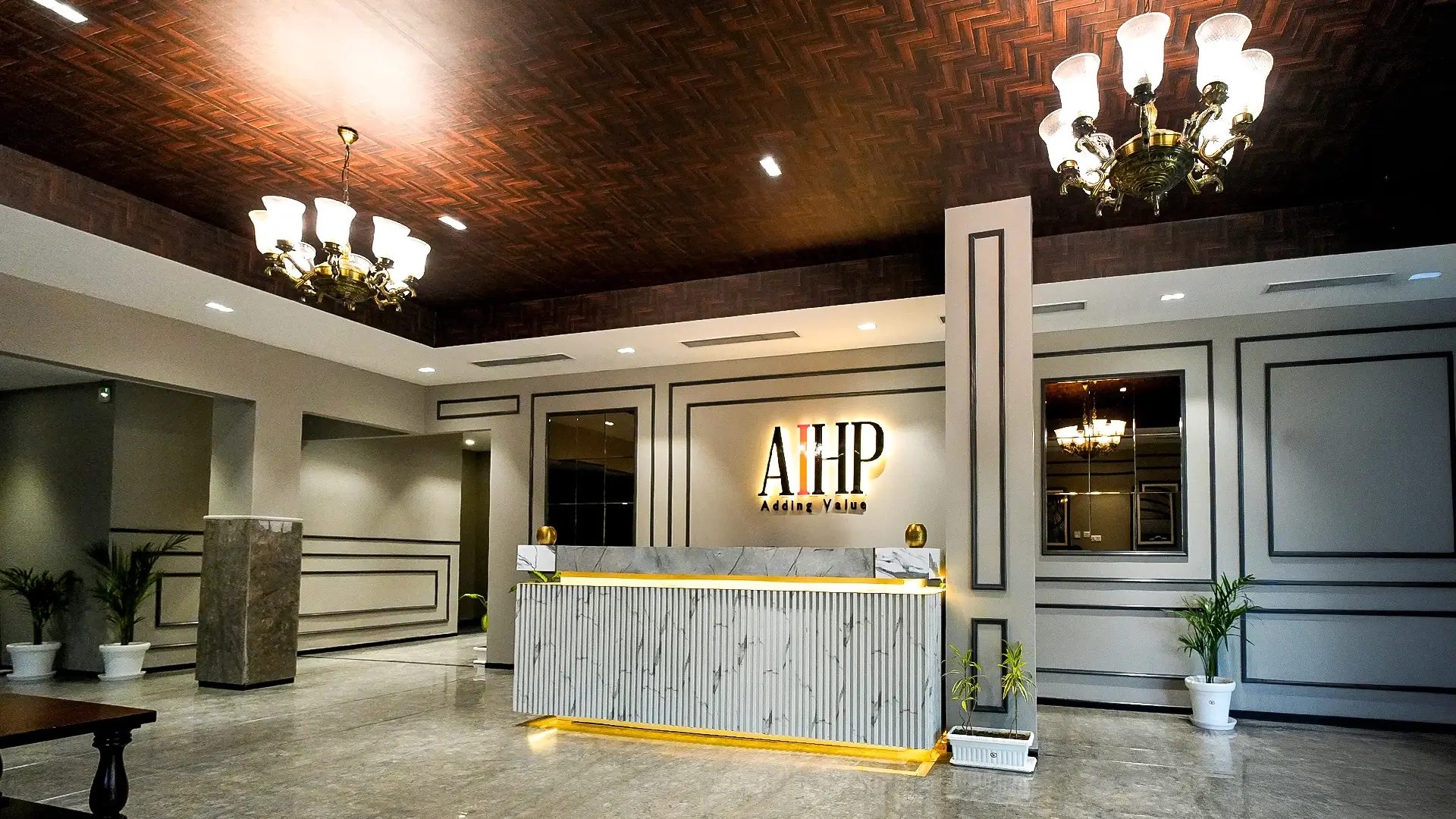
Brand Colors Without the Billboard
Bring brand tones in through wayfinding, joinery details, upholstery piping, door frames, and signage, not just giant painted walls. A sophisticated scheme usually pairs:
- Two or three timeless neutrals (warm and cool),
- One brand accent (used sparingly), and
- Natural materials (timber, stone, plants) to ground the palette.
This keeps daily life legible while your identity hums in the background.
What Research Says About Specific Colors (Use with Care)
- Blues/greens: commonly linked to calm, clarity, and “restorative” vibes good for focus and long reading tasks.
- Reds: heighten salience and urgency; in achievement contexts they can nudge caution/avoidance use as signals or small accents, not full walls in heads-down areas. (Source: PubMed Central)
- Yellows/oranges: social warmth and spark best as accents in collaboration spots.
- Neutrals: the unsung heroes set contrast, support lighting, and stop visual fatigue.
Remember: personal and cultural differences matter. Test before you roll.
Saturation & Contrast: The Secret Ergonomics of Color
High-saturation color attracts attention; that’s useful for signage and edge conditions (stairs, doors), but fatiguing when it floods the field of view. Opt for flat backgrounds (low to mid saturation) with intentional pops (wayfinding, touchpoints). Maintain high text/background contrast for readability and shun glossy coatings that reflect glare back onto screens.
Color + Lighting Playbook (So Palettes Don’t Backfire)
- Set desk areas to ~300–500 lux with neutral, even light; push warmer tones in lounges.
- Place screens perpendicular to windows to avoid color shift from glare.
- When you trial a color, view it under morning, afternoon, and evening lighting.
- When changing from warm to cool LEDs, re-eye your paint chips cooler light may make warm paints appear muddy, and vice versa. (Yes, it’s that sensitive.) (Source: Nature)
Inclusive Color: Easy on the Eyes for Everyone
Design for color-deficiency and sensory comfort:
- Employ pattern/shape + color for signage and wayfinding (not color only).
- Steer clear of extensive areas of fully saturated red or cyan; they may vibrate in some eyes.
- Offer matte finishes and fabric surfaces to reduce specular glare in high-traffic spaces.
- Keep emergency/safety coding clear and consistent across floors.
Usability research also shows that visually pleasing environments can increase tolerance for small flaws (the aesthetic–usability effect), so a thoughtful palette doesn’t just look good it helps people feel things are working better. (Source: Nielsen Norman Group)
Budget-Friendly Ways to Test Before You Commit
- Paint sample panels on foam boards; move them around during the day to see shifts.
- Pilot a single neighbourhood (one meeting room + adjacent bay) and run a short pulse survey on clarity, mood, and glare.
- Swap upholstery and art first; paint last. It’s cheaper to learn with loose items.
Common Mistakes (and What to Do Instead)
- All-white everywhere → adds glare and eye strain.
Fix: mix warm and cool neutrals for depth; keep ceilings lighter than walls. - Brand color overload → looks loud, dates fast.
Fix: keep it as an accent; let materials and wayfinding carry identity. - Ignoring lighting → colors “fail” after switch-on.
Fix: approve palettes under final fixtures and blinds positions. (Source: Nature) - Vivid walls in focus areas → constant peripheral distraction.
Fix: lower saturation near screens; use vivid tones to mark doors or collaboration nooks.
Putting It All Together: An Easy Office Palette Recipe
- Base: two workhorse neutrals (e.g., warm greige for walls, soft gray for joinery).
- Accent: a single brand color in 5–10% of the visual field (frames, graphics, upholstery).
- Nature: timber, plants, woven textures to add warmth and biophilic calm.
- Light: neutral, even task lighting near desks; warmer, dimmable layers in social zones.
Want help compressing all of this into a build-ready scheme? The Orange Offices team can transform your workspace with custom interiors and phase changes with minimal downtime. For mood-board ideas mapped to productivity goals, see Curated Workspace Designs for Productivity.
Conclusion
Color is a small lever with outsized impact. Treat it like a system paired with appropriate lighting, finishes, and activities and your office will chug along with less fanfare: more transparent wayfinding, reduced distractions for concentration, warmer conversation, and spaces that “feel right” upon initial glance. Test it, tweak it, and deploy it in stages. Your eyes and your team will thank you.